Alex Makes: Graphic Illustration for the UAL Sustainability Network

I am pleased to be able to share with you a notable creative project that came up for me in 2021. It was just the right mix of logical branding, minimalist abstract art and poetic conceptualism to get my brain cogs turning and creative juices flowing. I was excited to work on this, not just because the themes were right up my alley but because the organisation I would be creating for was one that is close to my heart.
The University of the Arts (UAL) Sustainability Alumni Network is a new community of UAL graduates that brings together and supports those who are using creativity to combat the climate emergency. As a former student and sustainability-focused designer and business owner, I was keen to participate in the formation of this community using the skills I have to offer. To launch the network, an in-person networking event was going to take place at Camberwell College of Arts, one of the six UAL colleges.
Rewind to summer of 2021 - the network is preparing for launch and needs an image that represents the aims of the organisation, a style that fits in with the UAL brand but distinguishes itself from the University as a whole and the many other graduate-led alumni organisations. Exciting! I love finding a problem to solve. But what are the aims of the network? How do other alumni organisations brand themselves? I would need more information on the UAL brand too. Communicating with the University's alumni coordinator, and through doing my own research as part of the creative problem-solving process, I was able to find out.
Discovery: Learning More About the Network
It is really important for me to gather as much information as I can about a project before beginning any creative work. I can do this by reading a design brief that a client has presented, and asking more questions if needed or discussing the project in person, via email or on a call. Once I get an idea of how I can assist with the project, I present a proposal of what I plan to do and when this is approved by the client, I do even more independent research as part of the design process.
In this case, I asked questions to learn more about the mission, goals, and features of the organisation. I found out more about their target audience, the primary platforms for marketing and communications and what they hoped to achieve with the design elements for their brand.
The UAL Sustainability Alumni Network (UALSAN) has a hugely diverse audience made up of the graduates of all six colleges of UAL, from a wide range of age groups, backgrounds, and creative disciplines (this would later make for a very interesting launch event!). The goal of the UAL Sustainable Alumni Network is to connect UAL graduates who are interested in sustainability and to support them with an events programme and networking opportunities. The Network facilitates dialogue around the climate emergency, promotes the work of alumni that are working to tackle important issues in a creative way, and does this in a way that is egalitarian and democratic.
With the basic information sourced, I went on to do my own research to find out how other alumni associations branded and marketed themselves. I like to get a deeper understanding of the field that I am designing for, including traditions and trends in the field so that I can know what kind of designs are popular, overused, innovative or unusual. You can get a feel for what might work well and what might be a bit strange (in a good or bad way) design-wise when you go on to draft some ideas. I tend to make notes and sketches while I research as inspiration and ideas come to me. These initial ideas are usually conceptual in nature and will be further developed into designs or used for reference later. I gather my initial concepts and present them in a way that hopefully helps the viewer understand how I arrived at the ideas and why I think they might work to meet the design brief.


Proposing a Solution to a Problem
University of the Arts London has a brand identity that is minimalist and flexible enough to easily convey collaboration and connectivity with internal and external entities. The colour palette is simple and primarily monochrome. The neutral font is unimposing. The colon element suggests that something is to follow - the University of the Arts does not exist in isolation or without the individual units that form it. The six colleges of UAL are branded as part of the whole. Their unique characteristics are not expressed in the logotypes, and perhaps that conveys that they too are nothing without their constituents - the students, graduates and staff of each college. The vast diversity of the London collegiate is what allows the University as a whole to become a leader in creative practice and innovation.

There are strict guidelines for how the UAL brand identity should be used and this applies to partnerships as well as internal use. Although an example is provided for how the Arts' Student Union logo could be applied as a partner of UAL, the guidelines for graduate organisations is unclear. As part of my exploration, I found that since many of the UAL alumni groups were formed and run by the graduates themselves, branding of these groups was not consistent. This may be partly down to the lack of guidance, but also the difficulty of enforcing guidelines on independently formed organisations that spring up online or internationally.

This brought up the question of how alumni groups should be branded. According to UAL brand guidelines, if an entity is directly related to UAL then the branding should be very different to independent entities. Since alumni groups are not formed under the institution, but by graduates who are technically constituents of that institution, there had to be a decision made as to what this would mean for the branding of an organisation like the UAL Sustainability Alumni Network. It was somewhat out of my remit to make that decision, which I discussed with the Alumni Coordinator and passed on to the UAL Brand team, but I did present several solutions for how the issue could be resolved. This included various styles of logo depending on the level of separation that the University brand would have from the alumni networks. I feel that this is an important decision that would influence how the UAL brand would be utilised in the future, and was happy to have contributed in some way to this development. Ultimately it was decided that UALSAN would be incorporated under the UAL brand, and have its name balanced on the other side of that connecting colon: an extension and part of the institution, like the colleges themselves. There's something sweet about that! It would be awkward to create too much separation between them, and it is quite meaningful that the graduates of UAL are considered an integral part of the whole.

Creating a Visual Theme
Another element of this project was to create a graphic illustration that could be applied to UALSAN communications such as social media posts and email newsletters. The graphic was to create a themed backdrop that would identify the content as being related to the Sustainability Network, ideally communicating the network's goals and features, appeal to the target audience and work cohesively alongside the UAL brand. Following the brief, I used research, design knowledge and artistic experimentation to create the following conceptual designs.
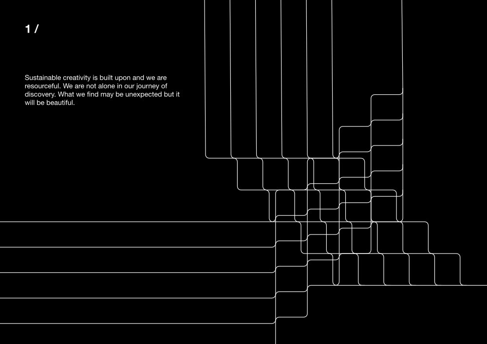
1/
Sustainable creativity is built upon and we are resourceful. We are not alone in our journey of discovery. What we find may be unexpected but it will be beautiful.

2/
Our thoughts are brought to life with the shape of our words and the force of our actions. We are propelled by our visions.

3/
Ever building, onwards and upwards, despite the challenges. We keep fighting for what is right, creating the world that we hope for.
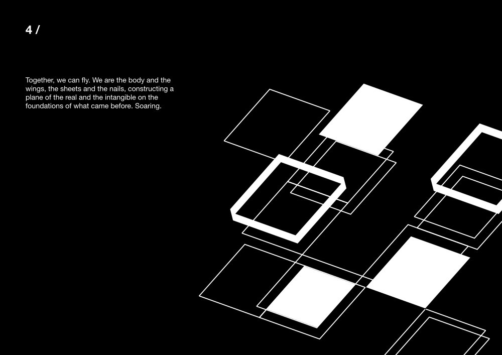
4/
Together, we can fly. We are the body and the wings, the sheets and the nails, constructing a plane of the real and the intangible on the foundations of what came before. Soaring.

5/
Joy, wonder and hope are the products of our labour existing in the form we give them.
The gifts born of our humanity channel and provide us our strength.
Based on feedback from the UAL Brand team, I narrowed down and further developed the concepts by bringing the designs more in keeping with the UAL brand through the use of colour and creating mockups of how such designs could be applied to social media content, which is one of the aims of the project. This also brought more clarity to what were quite conceptual illustrations, based on the brief and my research but abstract in initial expression. Once the designs were developed and shown in context, it was easier to see how the concepts would look and feel in practice.

1/
Our thoughts are brought to life with the shape of our words and the force of our actions. We are propelled by our visions.
Interconnected paths form a shared reality. The word ‘sustainability’ is just one thread in the tapestry.
---
The design is essentially a custom font and pattern in one, based on a simplistic grid. Guidelines for reproduction / adaptation would be provided.
This style can be adapted to various contexts, and used in monochrome or colour.

2/
Ever building, onwards and upwards, despite the challenges. We keep fighting for what is right, creating the world that we hope for.
---
The focus here is on upward movement, creation, progressive thought. Stacked shapes and colours symbolise diversity and inclusivity.
Arrows and triangles could also represent the natural world that is to be protected - trees and mountainous landscapes - as well as aspiration and the construction of our future.
The examples here are shown in Green #00C73E but the design can be recreated in black and white, or an alternative colour in the UAL brand palette.

3/
Together, we can fly. We are the body and the wings, the sheets and the nails, constructing a plane of the real and the intangible on the foundations of what came before. Soaring.
---
Here, similar shapes, like panels or brickwork, form a surface as the efforts and ideas of individuals might form an ideal bigger than the self.
There is potential for interesting real world recreation using combinations of materials, or animation for digital use.
The 'rising rectangles' design was the chosen concept to move forward with. The various shapes represent the diverse 'units' or individuals that form the network - they combine to create expansive structures and dimensional planes. The overlap of the shapes suggests the forms either rising or supporting each other and sometimes it is not clear which is occurring. The aim of this design was to communicate the subtle beauty and power of individuals forming a structure and the uplifting of those individuals and their ideas within the Sustainability Network.
I wanted this design to be replicable so that it could be adapted to various contexts, for example if a new poster design needed to be made then it could be done by a different designer whilst maintaining consistency of the brand style and therefore create a recognisable theme that could be used across a variety of formats. This meant developing a system that would be easy for another person to use to change the design without altering the fundamental elements.
The fundamental elements of the design are the shapes - rectangles with thin outlines, thick outlines and filled shapes - and the basic layout of those shapes in the given space. I use Affinity and Adobe software to create artwork digitally, and I enjoy developing my skills in both. For this task I played around in Affinity Designer (an alternative to Adobe Illustrator) to create a grid at an angle that I felt suggested movement and progression, but also allowed the shapes and layers of the piece to be apparent.
Once you have a grid, and basic rules in place for the use of the elements of the design, the outcomes are more likely to be consistent even if you move things around. Some of the rules include the types of shapes you should use and how you can place the shapes, the colours of the shapes and the weight of the lines used.
I compiled some examples of how the different types of rectangles should be used together. The use of only solid filled shapes was excluded, as I felt that the outcome did not conform enough to the original concept, but the following worked well to convey the idea:


Although I would be providing image files for the specific uses outlined in the brief (social media and email newsletters), the editable artwork files would provide some creative freedom for future designs that may be needed. I also provided examples in colour using UAL brand colours, to keep that brand consistency going.

As well as digital designs, I would also need to create a poster design for the launch of the UAL Sustainability Alumni Network. The process of designing for print is different to digital because you have to work at a different scale, you have access to different colour choices and have to choose the appropriate settings in your design software, and there are different things to look out for when proofing your work. For this project, since one of the goals is to align the designs with the UAL brand, it made sense to use existing poster design templates with UAL branding already applied. It is very possible to create my own unique poster layout using UAL guidelines which would involve adhering to specific spacing requirements around the logo and other elements, but it can be inefficient and unnecessary to do so if there are templates available. I highly recommend that brands have templates for their frequently used formats ready to go, to ensure solid brand communication and efficient design execution. After sourcing design templates for the event poster, I chose the most appropriate layout and added the new themed illustration.

The Launch
The UAL Sustainability Alumni Network officially launched on the 30th November 2021 with an in-person event at Camberwell College of Arts. Attendees were welcomed with drinks and vegan snacks before being led to an auditorium to see presentations from UAL graduates about their creative work to tackle sustainability problems in their fields.
The speakers included: David Cross, artist and UAL academic; Nikita Jayasuriya, Partnership Director at Parley for the Oceans; Katie Kubrak, Materials and Insight lead at Nirvana Creative Production House; Jade McSorley, co-founder of LOANHOOD; Zoë Powell Best, Materials Researcher.
The presentations were fascinating, showing how uniquely and creatively individuals are working towards a shared cause. It was really exciting to see what other people are working on, to learn about some of the technologies that are being developed for the purpose of sustainability, and also to find out more about the UAL mission to function sustainability and promote sustainable practices.
I was pleased to see that the poster designs turned out as intended and were utilised in several areas to highlight the event and as signage to lead visitors to relevant areas. The design was in keeping with UAL branding and fit in with the minimalist spaces of Camberwell College.
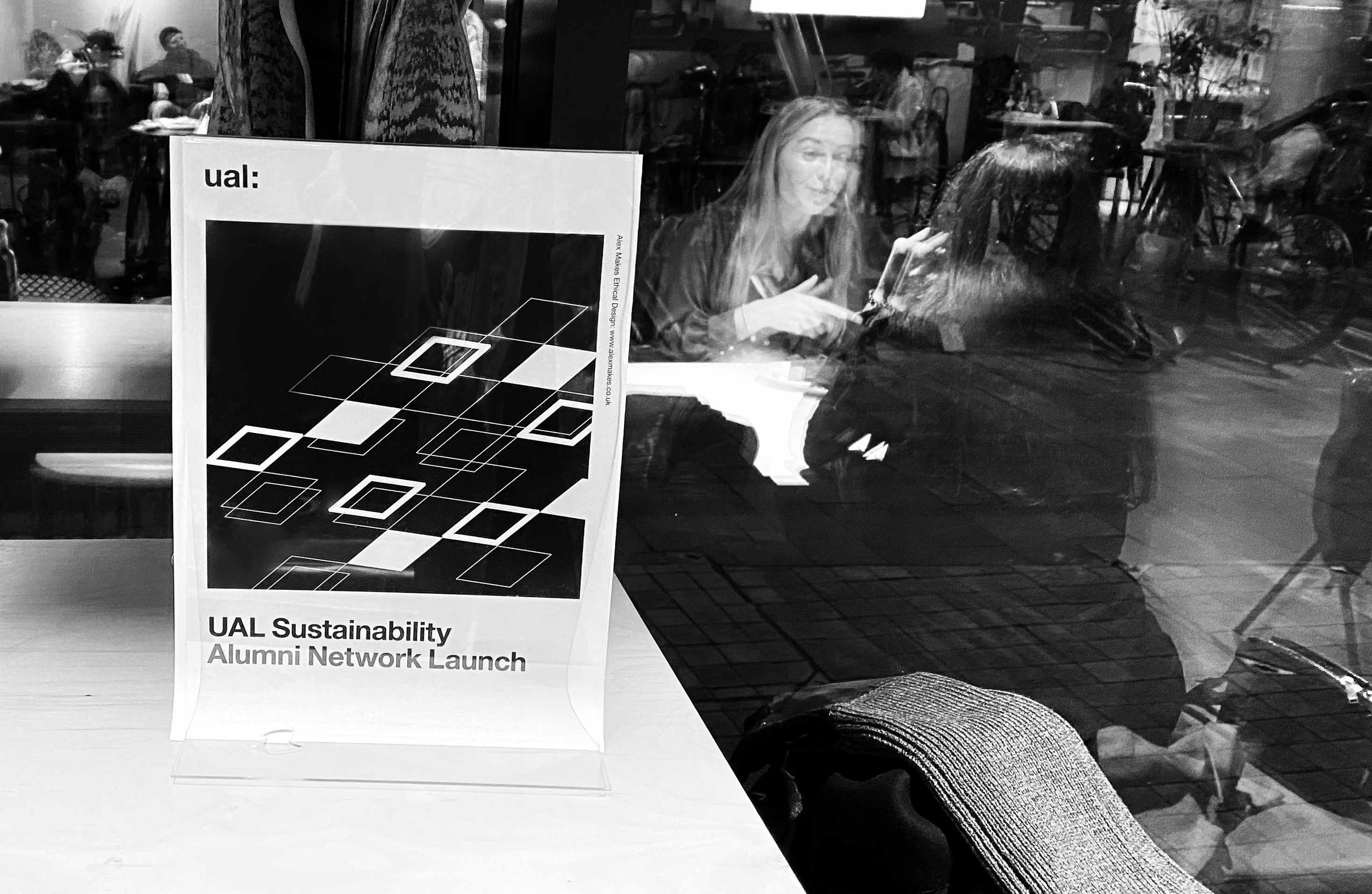
A table-top display stand presents the UAL Sustainability Network launch poster at the event.

An email following the organisation’s launch event contains the graphic that was designed for the UAL Sustainability Alumni Network.

The poster for the launch event was displayed in the corridor and stairwell leading to the auditorium where talks were presented for the event.

Thank you again for the work, we really do appreciate it! ...The work was really well researched and designed, and you understood the brief really well. I will continue to recommend you internally.
- Maria Ryan, Alumni Coordinator, University of the Arts London
Thoughts on the Project
This project was fun and satisfying, mainly because it gave me an opportunity to find a problem and solve it! There is usually a problem that needs solving when working on a graphic design project and it takes asking the right questions to clearly identify what that is before we can come up with a creative solution. We may not always think about the nuances of relationships and how that reflects in the nuances of branding. It can be fascinating to delve into that, to figure out what we want to say about ourselves and our relationships when we are not the only ones embodying that brand.
We can see that the UAL brand messaging makes a statement whenever it is applied and one of the things I want to find out when I explore deeper into a brand and work on its communications is: if we apply the branding in this particular way, will the statement still be true? How can we ensure that the messaging remains authentic and meaningful? When there is a gap in this area, the solution is to have a strong brand message, clear guidelines on implementation and ways to ensure that the branding is consistently expressed so that every time it is experienced, the intended message is clear.
University of the Arts London continue to show through their design choices that their students and graduates are the University - the people are the leaders in creativity, innovators and problem-solvers, the creative industry, the builders of meaning through communication design. It has been a pleasure to contribute to the development of the University's sustainable community with my work, and I am excited to see what the community will achieve in the future.
Learn More
Do you have a similar project you would like to work on with me? Tell me more!